Bay State Physical Therapy

Rebranding rehabilitation.

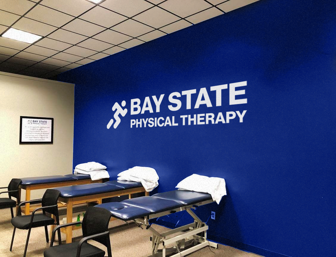
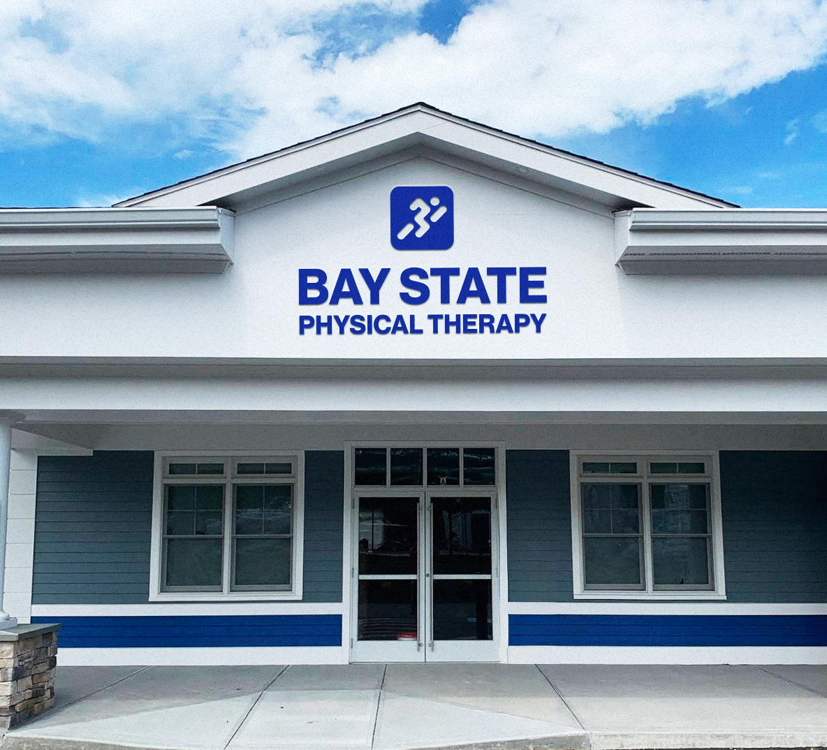
When Bay State Physical Therapy came to us for their rebrand, they wanted to get away from the sports centric branding they previously had, and make it more about movement. Their target audience isn’t pro athletes. It’s your average person that just wants to be able to move better. The new brand identity expresses that idea in a simple but elegant way.

City street scene with two pedestrians walking past a building with a sign that reads 'coming soon' and 'Bay State Physical Therapy'
Abstract logo design with multiple dark blue rounded shapes arranged diagonally on a light gray background.
A physical therapy clinic room with two therapy tables covered with white towels, chairs, and a sign on the wall stating "Bay State Physical Therapy" and its logo.
Front of a building with a sign that reads "Bay State Physical Therapy" and has an icon of a person running.
Sign for Bay State Physical Therapy on a glass window with a street scene reflection, including parked cars, trees, and buildings.